
Role and Responsibility
Opolis has a big idea to change freelancer employment across the US through networks.
There had already been several false starts initializing this project before I came onboard, and resources were dwindling.
This attempt was potentially the last shot at getting something started, and there was no one else to take charge, so I volunteered and stepped up to lead the initial phase to get it off the ground.
This was my very first project as a UX Designer.
I led:
Requirements Gathering and User Research - Brought together and curated needs of Opolis and users
User Experience - Researched key users, ensured product fit, mapped application experience
Prototyping - Created all low fidelity mockups and tested against users
Visual Design - Produced custom and semi-custom components + Design System
And aided in:Project Management - Worked to keep deliverables on schedule and on budget
Information Architecture - Creation of hierarchy of information + writing of copy
Vision - Understood and helped to push ultimate goal of organization
Strategy - Helped leadership to think through tangible deliverables
Collaboration and Research
With no resources to dedicate to validation and user research, I had to get creative. To begin with, I interviewed the stakeholders in the company, documenting the responses and created a project brief.
A starting point, surely, but I still wanted to validate the problem with real users. I got lucky and found a group to help with my research.
During Denver Startup Week in 2018, I attended a group event called Better Together, who’s sole purpose was to find out what freelancers needed and why.
The data and research that came out of that event was tremendous for my research purposes. Feeling good about validating the user problem, I progressed to researching a solution.


While the entire problem was novel, some of the individual parts were not.
Once I validated the user problem, I could move on to competitive analysis. I curated a list of companies which approached similar problems and documented their user experiences so as not to reinvent the wheel where we could.
Essential Business Logic
A part of figuring out this complicated system was participating in crucial discussions around Business Logic, as these would have a profound impact on the user experience and development.
As a liaison between development and leadership, as well as singularly in charge of all things design, it was important to be a part of and contribute to these conversations and decisions.
Process
Based on my research I produced user personas, which helped to validate and drive the Red Routes, requirements and functionality list, user flows, and ultimately the wireframes.
The most important part of this process was curating the potential list of features into an MVP and getting leadership buy in on the requirements and my proposed timeline.
The understanding of user needs directly translated into prioritizing functionality, developing an MVP, and pushing forward with curated objectives. This significantly reduced the features originally envisioned, however it also significantly increased the likelihood of success of the product.
Discovery and Research:
Due to the fast pace and limited team resources, I leaned on precedent analysis, team decisions, and my own instincts when making design decisions. I would typically look at 4-5 precedent designs from other DeFi platforms and then quickly adapt ideas for Overlay’s interface.
I relied on community feedback on production design to understand user pain points.
Design Strategy:
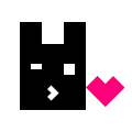
I developed and wrote a simple design ethos to balance Overlay’s highly technical nature with a playful, meme-driven brand identity.
This aligned minimalism as the predominant language on the UI which allowed me the freedom to move quickly on features when time was of the essence.
Additionally, pixelated / 80’s style interfaces were popular at the time I started designing for Overlay.
Therefore, I made the decision that a minimal, flat, paired-down interface would be best.

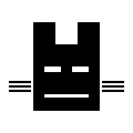
The first iteration - yikes.
Execution
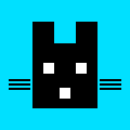
I built a design system on the fly that would simplify future design and development while maintaining consistency across the user experience.
This system was designed to accommodate developer limitations while ensuring a smooth user experience.
The community played a crucial role in guiding the design. Much of the early user feedback came through Discord, where I engaged directly with our user base. I responded to complaints and gathered insights that helped me adjust the user experience iteratively, even though we didn’t have formal UX testing resources at the time.


Critical Design Decisions
To elevate the product and reduce user friction, there were several key decisions I made throughout my time building Overlay that highlight the types of decisions I made and the work I did.
Focus on the product
The design ethos and stakeholders drove an early decision to have users first touch point be a market page (in web2 terms, this would be akin to landing on the purchase page for a product from anywhere).
While initially I felt like this made sense in context to our domain, I quickly realized that there needed to be a step before to differentiate Overlay (aka, what it is).


Highlight visual language
We received feedback from prospective vc’s that they felt like the UI was too simple, given the novelty of the project. This was a pretty fair point. While I had considered this, it was not something I felt like we ever had time to explore properly. I felt that Overlay had to be truly unique. I now know that in putting the best design possible off for the future, minimalism became a more permanent fixture when it should have just been a short stopover to something more wonderful.
So, I started leaning into our tech. I defined the art direction of the visual language and choosing images that will eventually represent positions as NFT’s, I helped steer the direction towards the visual language becoming the product.

Ascetic minimalism to...

...visuals become the product.
Art Direction
I sought out, hired and partnered a brand design firm to upgrade the branding and logo from it’s original form, inherited from the first founder drawing on a napkin.
We worked closely together to synthesize the mission and vision of Overlay, and after several weeks, I presented the proposed revision to the team. Upon approval, I spearheaded the rolling out of the new brand across our socials and partners.
This branding included color pallet, voice, and a visual language which is still in use today.
➡️
Taking the brand from 0 to 1
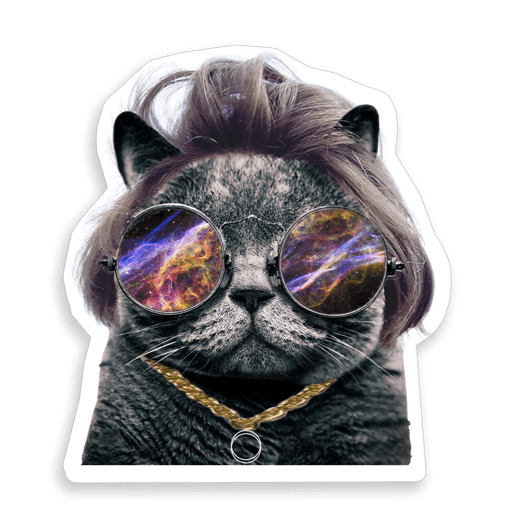
Additionally, I utilized AI (GPT 4o and Midjourney) to aid in the creation of artwork that was used for NFTs to incentivize the community.
I presented a number of different
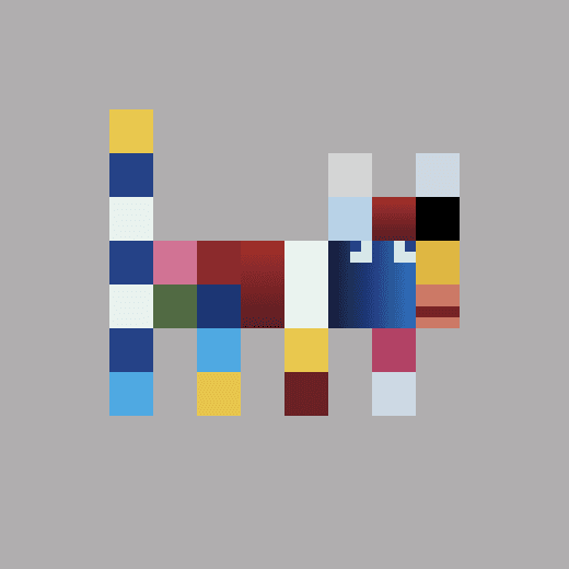
In retrospect, Overlay is still missing a consistent graphical language to root in. My other responsibilities took precedent over the development and maintenance of a consistent language, and at the same time, the language kept evolving to match the directive of the project. Below is a sample of some of the art I produced while exploring what Overlay could be (mostly created in Photoshop, Illustrator, Figma, or with the aid of AI).


I also engaged with the community who are seemingly always willing and eager to create content based on the Overlay brand. I had less control over this, of course, but I helped users from all around the world with no formal training create memes, videos, artwork, stickers, and general content for the protocol. Here are a few samples:

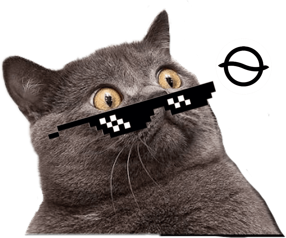
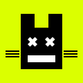
Internally, I also collaborated with the marketing and communications leads, giving them flexibility to execute on branding and community outreach based on our initial design ethos. While I had the final say on major design decisions, I had to allow some aspects of the brand and user interface to evolve independently due to my other operational duties. For example, I had a say in delineating the cat as our meme, but it was our head of comms who came up with our pepe-cat cartoon mascot.
Challenges and Trade-offs
The biggest challenge I faced was balancing product complexity with user simplicity. Overlay’s backend was incredibly technical, which resulted in user confusion—particularly around understanding why their returns or PnL didn’t align with their expectations.
In the beginning, I prioritized documentation over making the interface more explanatory. Given my operational duties as COO, I didn’t have the bandwidth to hire and onboard a full-time designer to tackle these issues, so I worked with a technical writer to develop extensive documentation. However, looking back, while documentation was critical, I would have preferred to integrate more of that information directly into the UI with in-line explanations or visual aids to reduce friction for users.
Additionally, resource limitations meant I had to make snap decisions.
Designs that would have typically taken me two weeks were done in a matter of hours. This compressed design process led to less iteration and refinement than I would have liked. In hindsight, this created a disjointed user experience as the platform grew more complex, and I wish I had been able to take a more holistic approach.
Results
Despite the challenges, the product achieved several milestones:
Raised $4M in seed funding, with $750K coming from my direct efforts during a market downturn.
Launched a test environment that attracted thousands of users, allowing us to gather critical feedback for future iterations.
Grew a thriving community with 100K Twitter followers and 80K Discord members, driven by the balance between our technical rigor and playful branding.
Began pivoting to a more information-dense interface based on feedback from both VCs and the community, who felt the initial interface was too simple. Early designs have been well received by the community, who appreciated the more transparent presentation of complex market data.
Outcome
My time at Overlay was a crash course in balancing visionary design with the realities of startup life. The compressed timelines and resource constraints forced me to prioritize quick wins over deeper iteration, but the experience taught me invaluable lessons in trade-offs, prioritization, and community-driven design.
Looking back, I recognize the importance of in-line user guidance for highly technical products like Overlay. While our early target audience was native DeFi traders, many users still needed more hand-holding than I anticipated. As we enter a redesign phase, I’m incorporating more data-driven elements and visual aids to better meet users’ needs while staying true to the technical complexity of the product.
Ultimately, Overlay taught me how to balance multiple roles, lead a product in a rapidly evolving space, and drive innovation while maintaining a clear focus on both UX design and business goals.